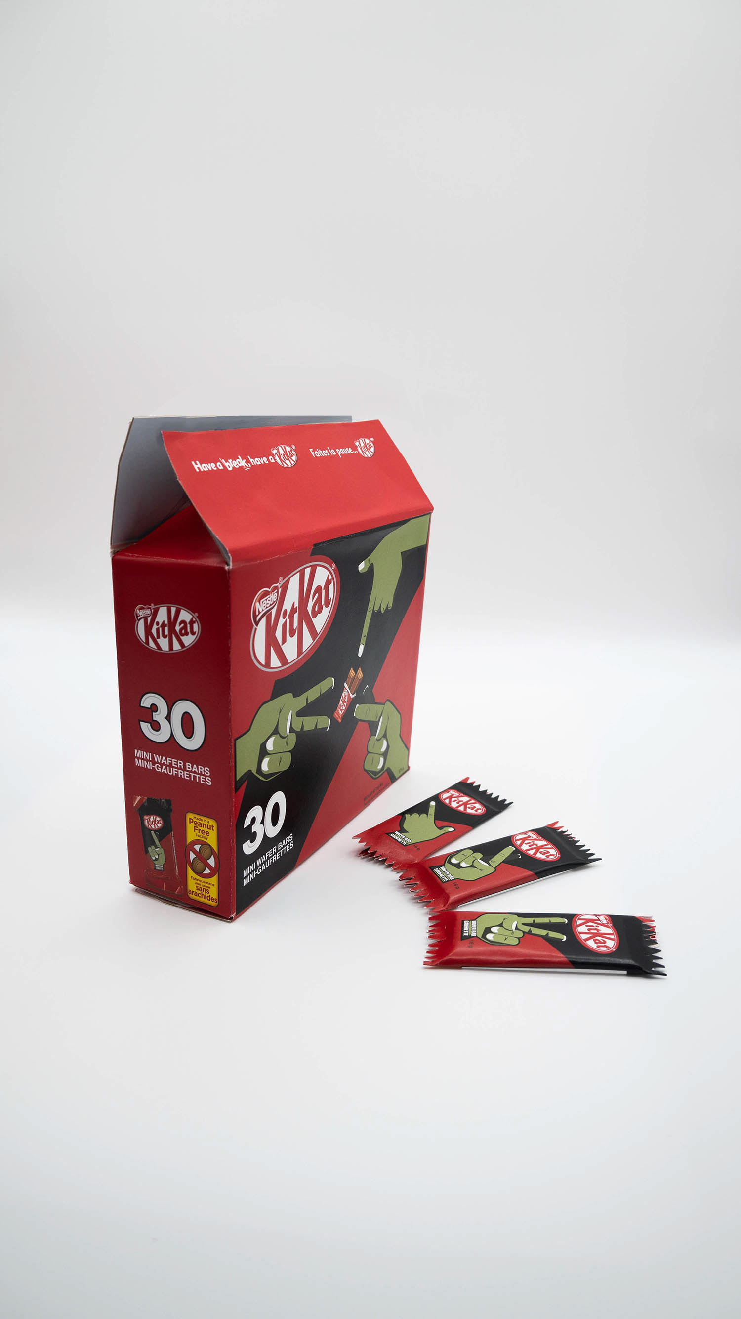
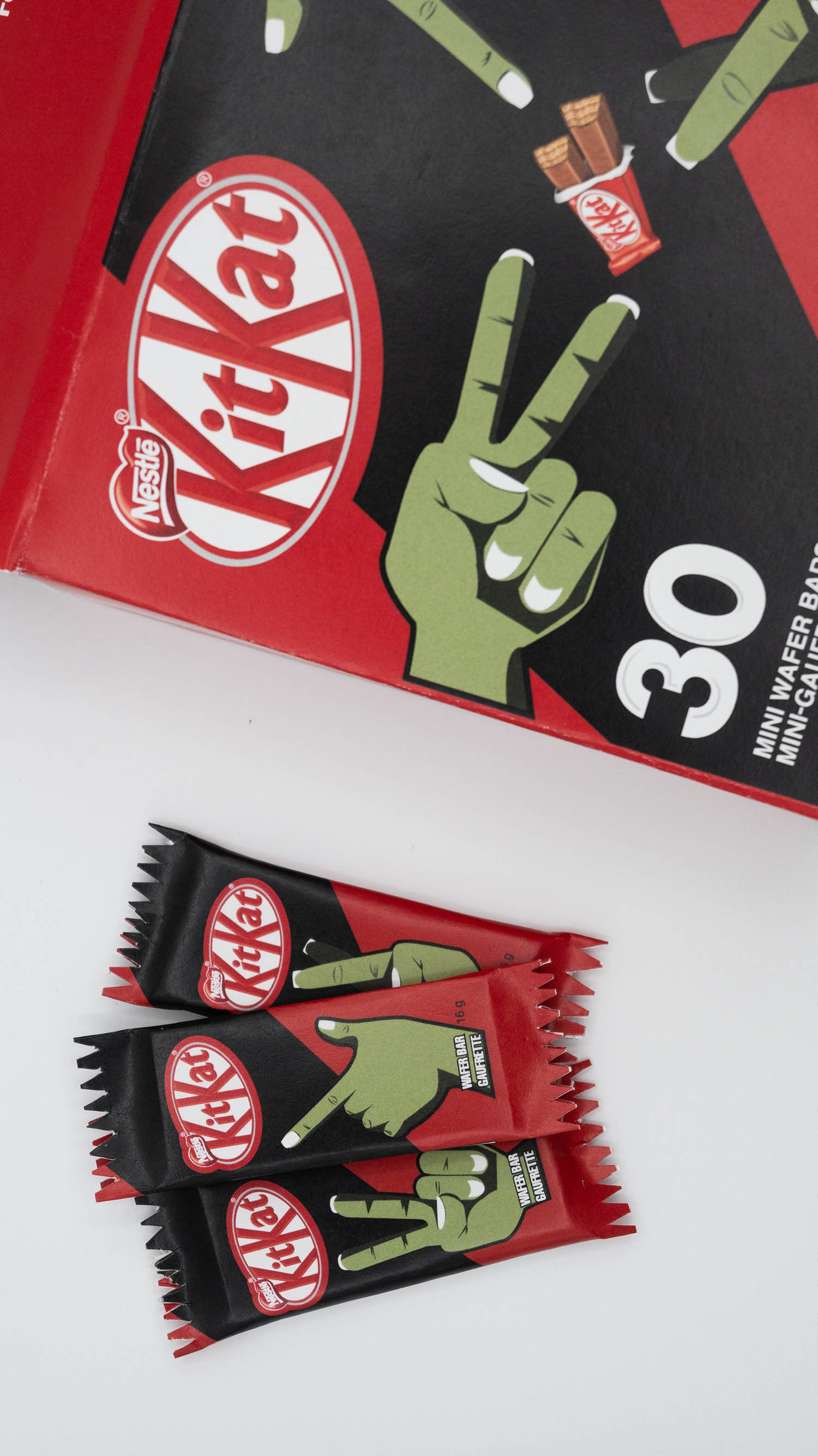

KitKat carries itself as a child-targeted brand. While designing a Halloween-specific KitKat, this had to be taken into account, and the design had to be kid-friendly as it would be handed out to children on Halloween.
Upon researching Halloween creatures, I settled on zombies, specifically focusing on their hands to draw attention to the box and wrappers. Friendly hand signs are included in this edition of KitKats, consisting of a peace sign, fingers crossed, and finger guns. All three hands are displayed on the package, and each one is indicated on its own wrapper. A muted green was chosen to show they are zombies' hands, and a thick black line in the background is used to bring the overall design to more of a darker side, all while still keeping it light. All other design decisions, such as the red, the logo, and the slogan, were made by KitKat’s brand itself.
This design results in a brand-new KitKat package geared towards children and Halloween, encouraging children to be kind and friendly towards others.


