
Joe’s Tasty Travels is designed as a cheap, on-the-go snack. However, what if it were portrayed as high-end?
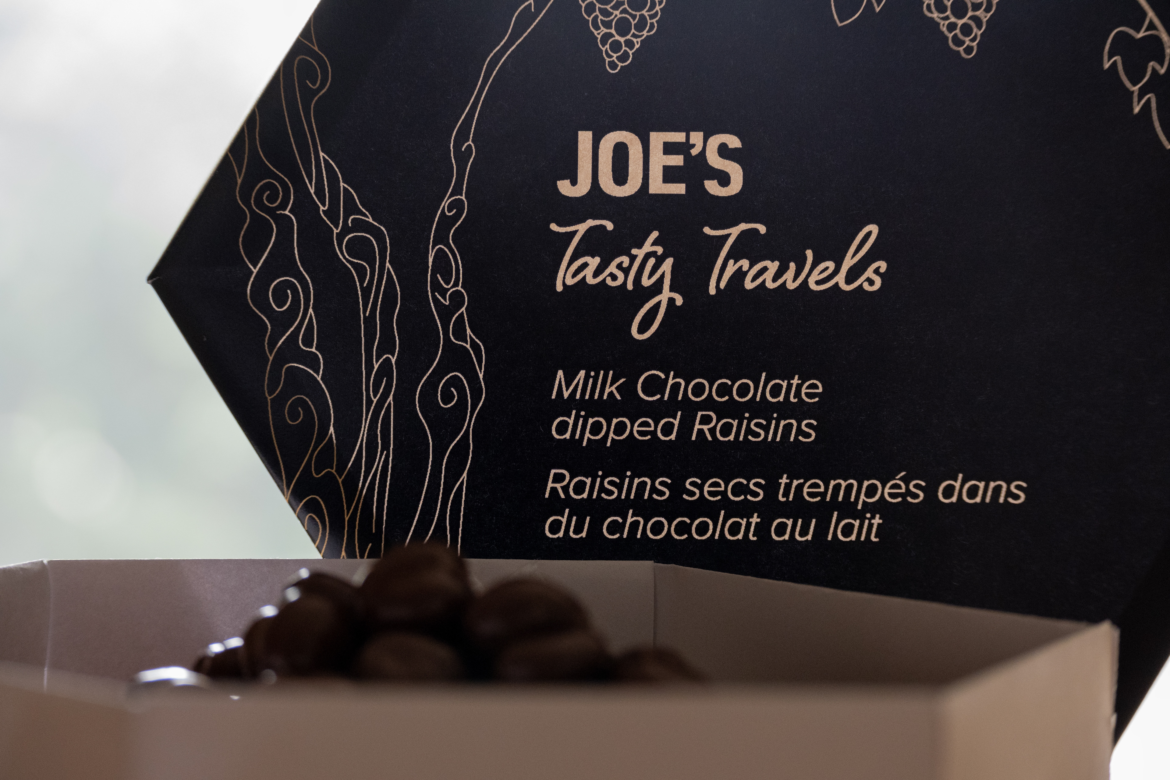
Taking on the challenge of redesigning an in-store product was quite the undertaking. I wanted to make sure the product was still appealing to the senses and refine it to the point that people would be inclined to spend more money on it. I did this by changing the logo to a simple wordmark. A bold font for "JOE'S" draws the consumers’ eyes to the brand name, and the script font of "Tasty Travels" leads their eyes to the common name, domicile, and net weight. Updating the colours from light lavender and chestnut brown to black and gold automatically makes the consumer believe that the product is better quality, as gold is associated with royalty and riches.
Illustration-wise, the style was changed dramatically from a more rustic style to an elegant and graceful one, deepening the idea that this item is now high-end. Building on that, the golden colour was used for illustrations of grapes to guide the eye around the packaging. The bunches of grapes point directly at the brand name.
My findings were that the brand doesn’t necessarily need a logo, but rather a minimalistic word mark. By framing the content with illustrations, it was more obvious what the product was. Using black as the background provided high contrast to the gold, creating an elegant look when paired together.
Original Packaging


