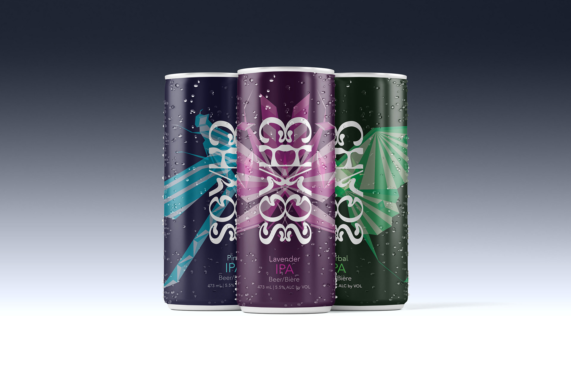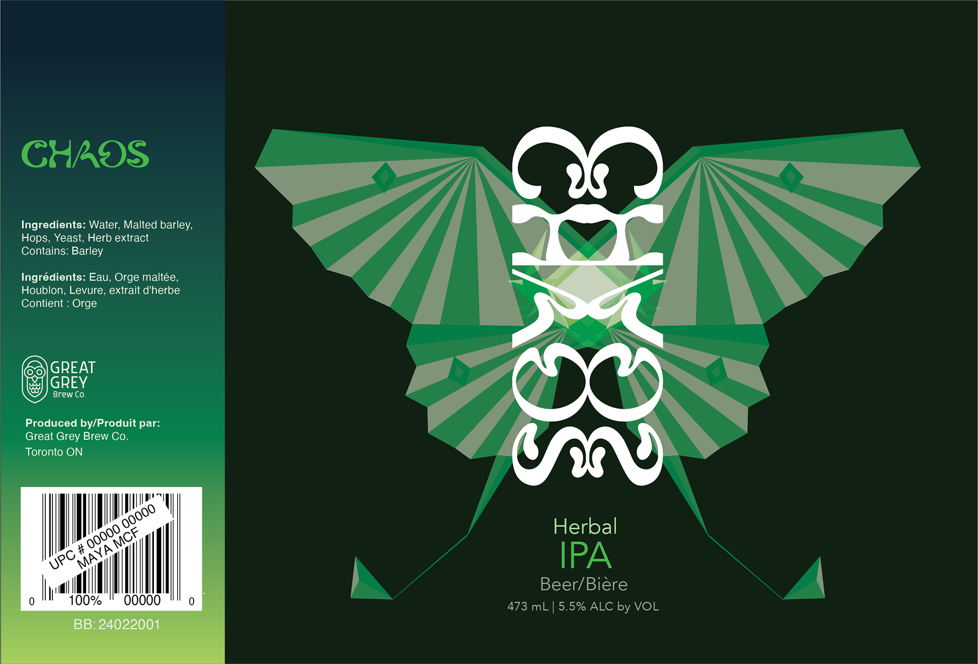


There are many types of craft beer, and they are all very unique. Though the story of Hexopoda IPA, it’s pretty chaotic.
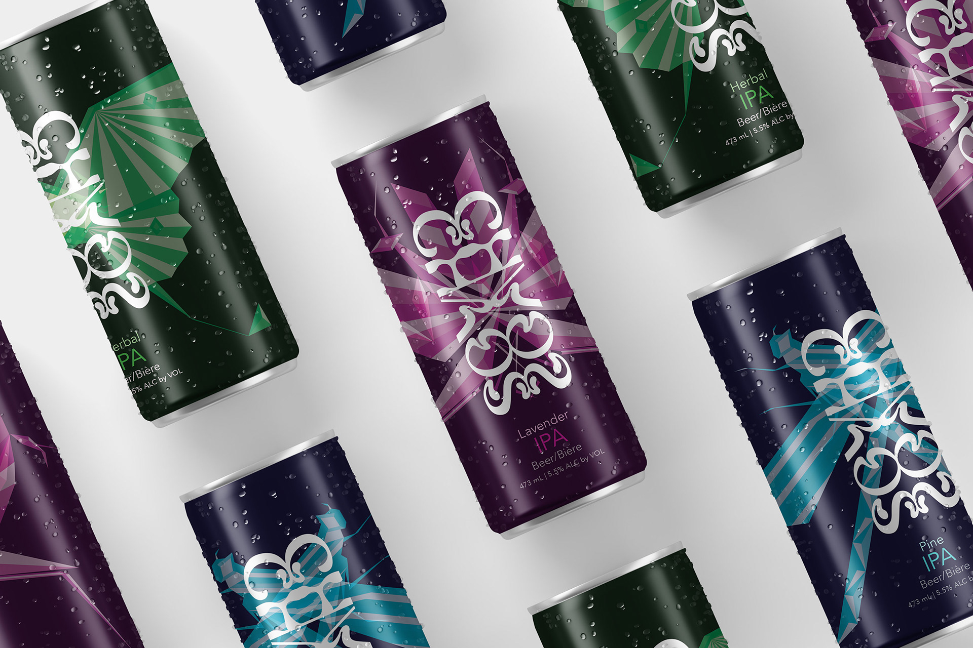
The first edition of Hexopoda IPA produced naturally flavoured IPAs in an elegant way. Gradients were used to provide contrast toward the top of the can, creating interest in the unique name. The insects chosen are all ones that can fly, sending home the idea that this IPA is freeing, and are geometric in style to ensure they stand out on the shelf.


As for the manufacturer, Great Grey's Brew Co., features cool, calming colours, representing the brand is trustworthy. A simplified owl is used as the icon and symbolizes the ability to be wise and knowledgeable, relating to the company's tone. A sans serif typeface, Morl, is used for the type in the logo and headings for the brand because it features a tall x-height, allowing for increased legibility.


Concept sketch of praying mantis
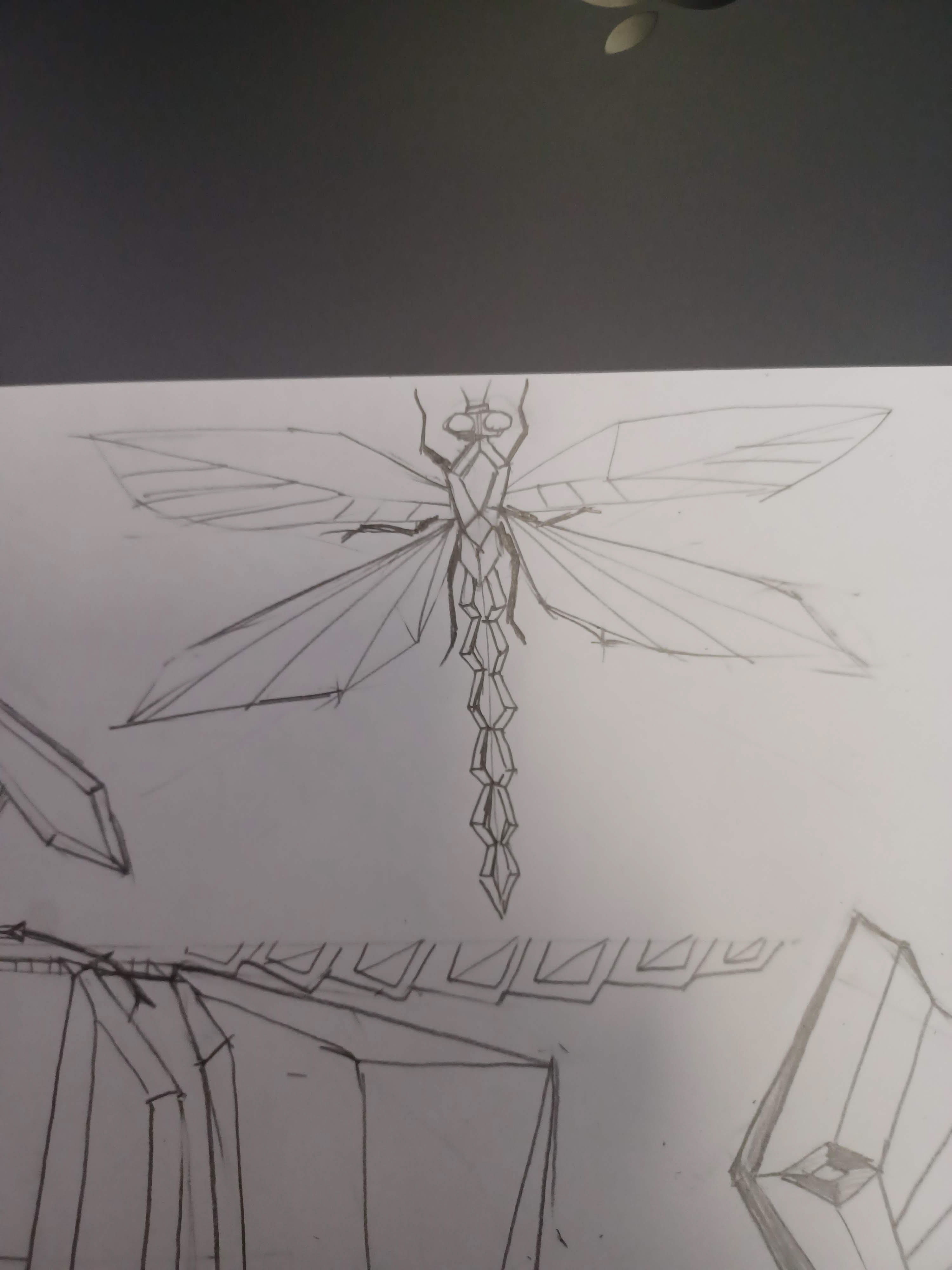
Concept sketch of dragonfly

Concept sketch of praying mantis

Concept sketch of luna moth
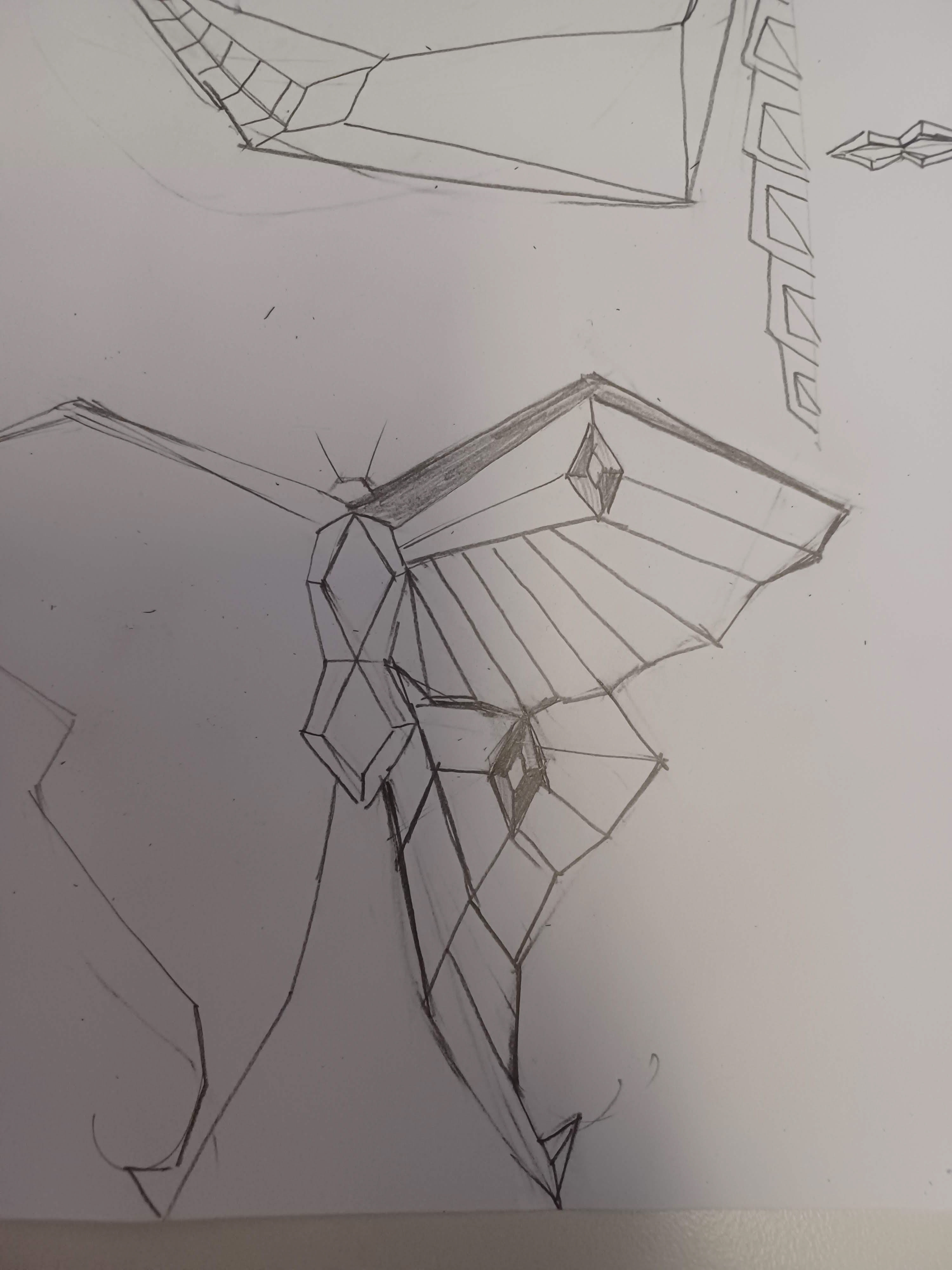
Concept sketch of luna moth
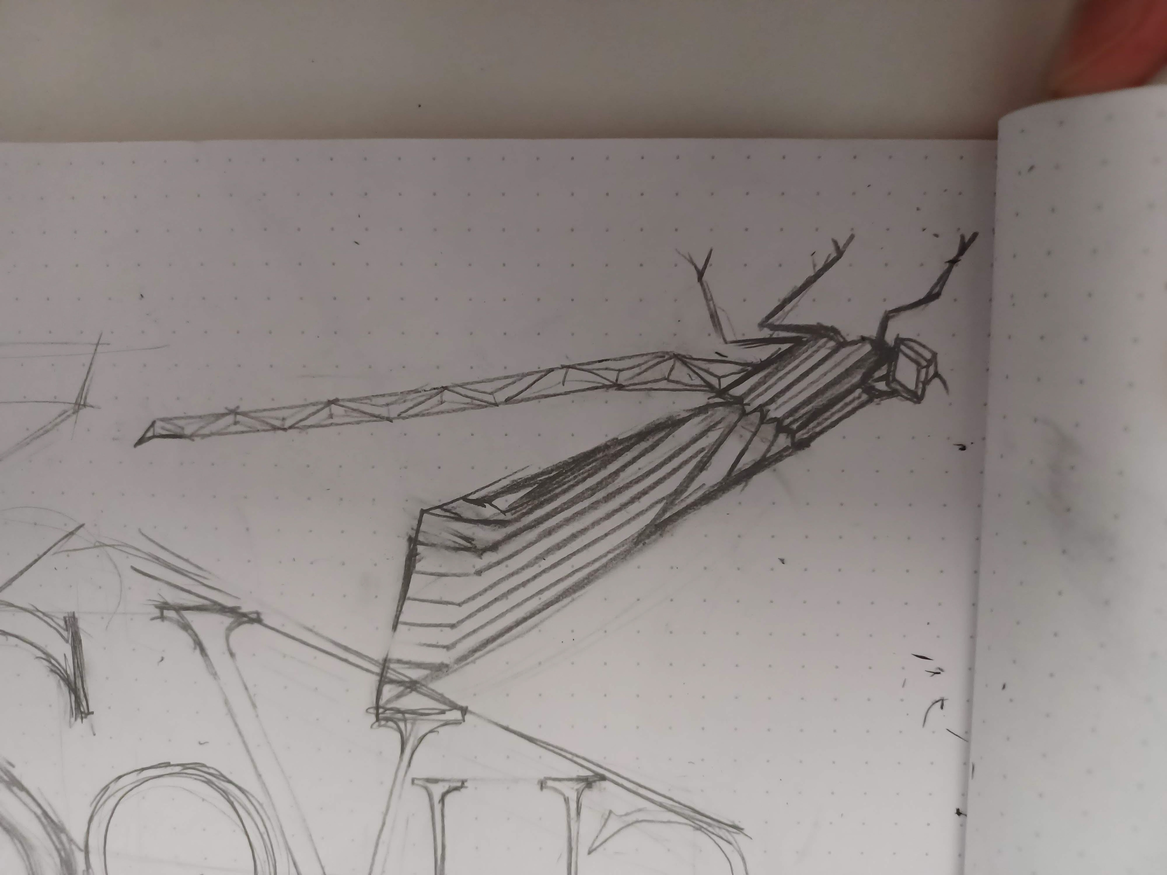
Concept sketch of damselfly
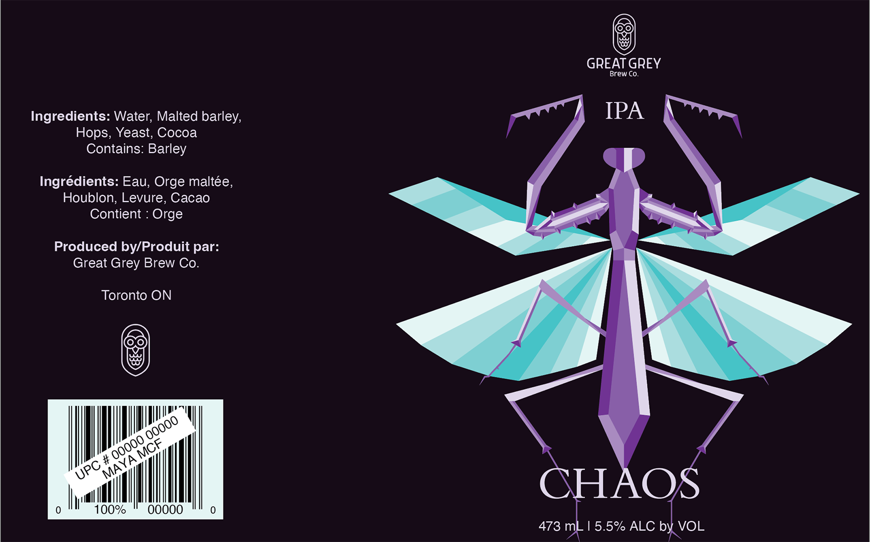


Above, you can see the process of how I got to where I am now. I started with a mirrored illustration of a praying mantis and then a luna moth. From there, I played around with different compositions, layouts, and colours, eventually ditching the black background altogether and coming up with another insect, a damselfly.
Original Packaging
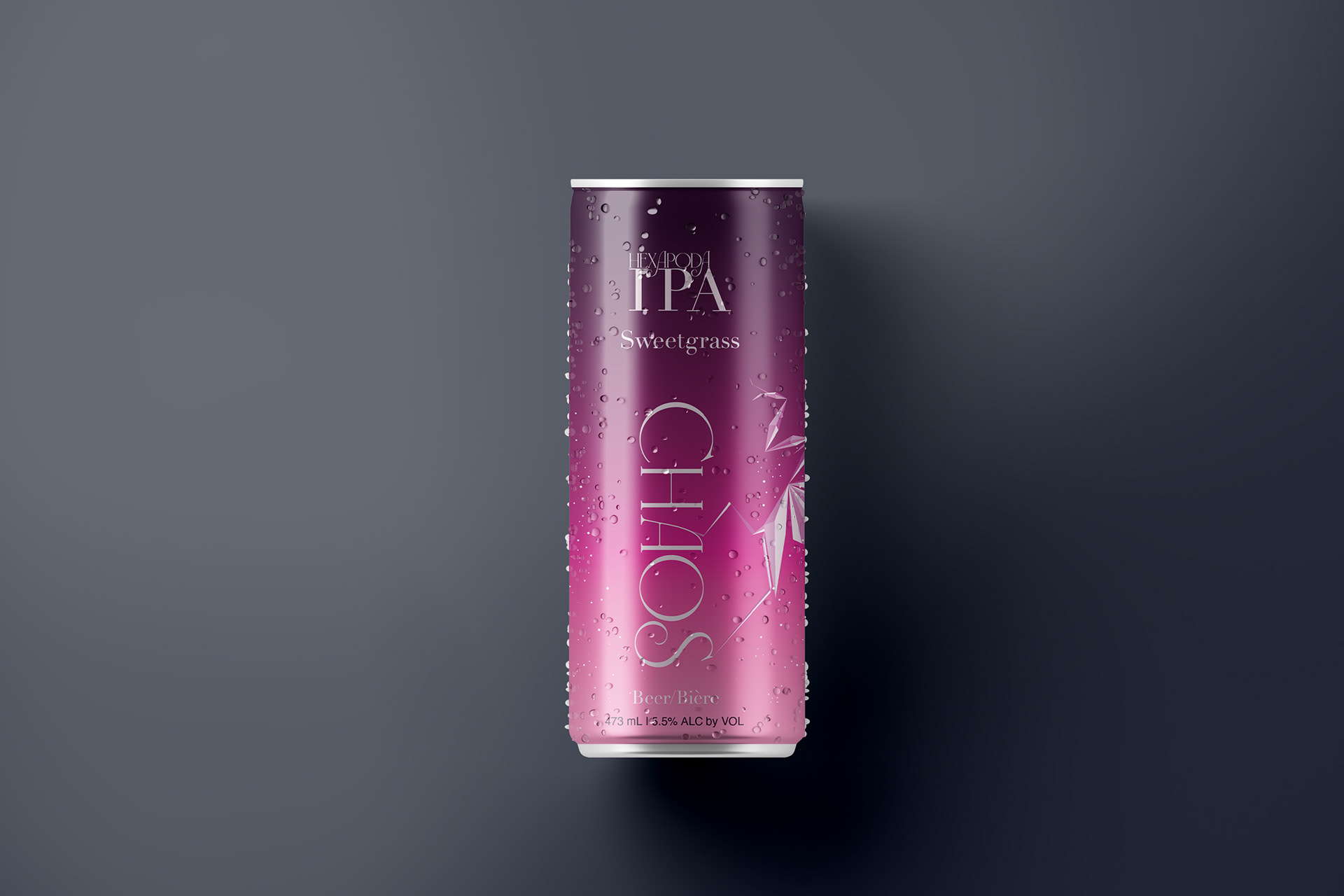

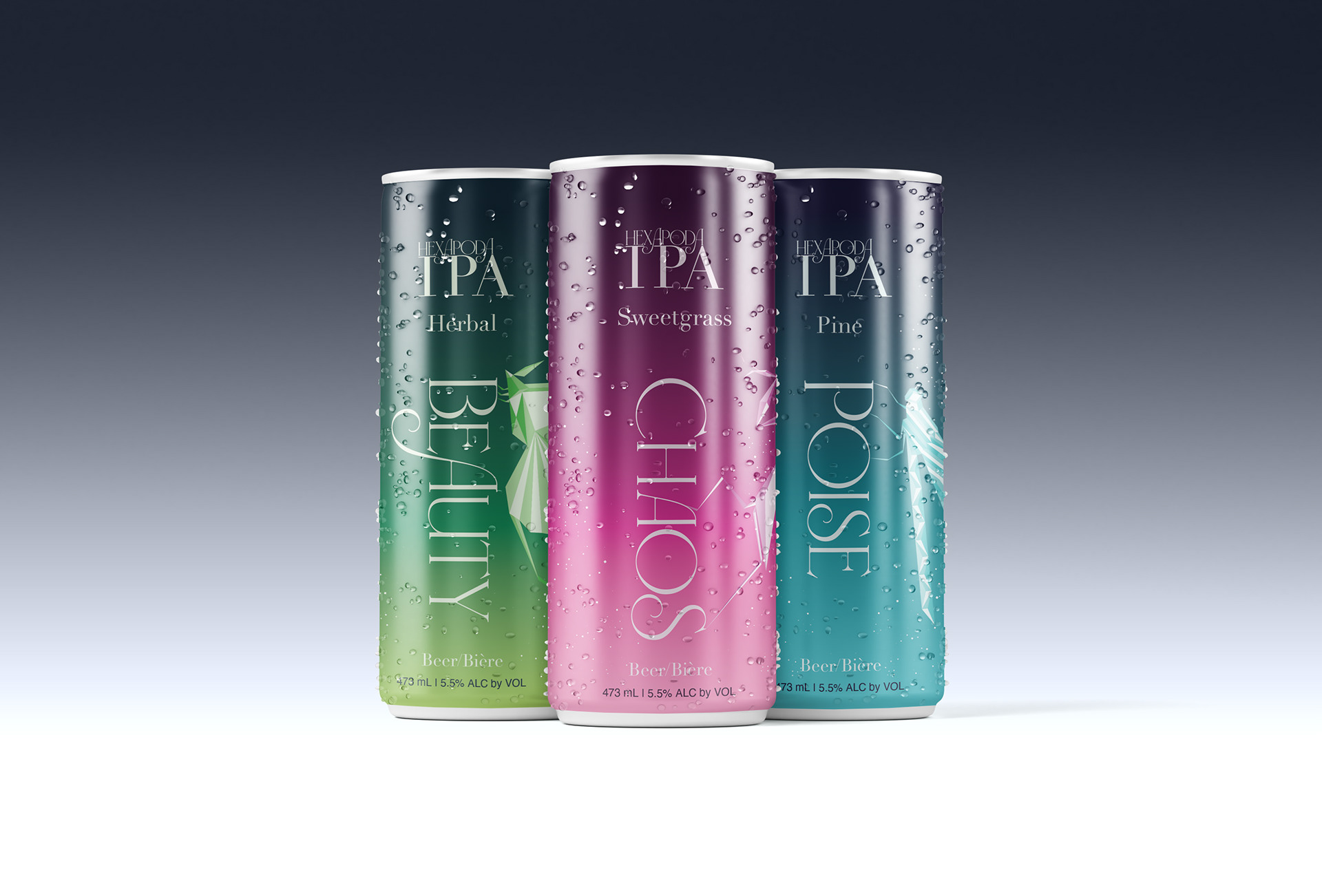
Looking back on this beer can design a year later, many things could be improved upon, so I decided to rework it. The message behind the beer originally was to embody freedom, however, while creating concepts to redesign it, I decided to take a step back and work with the idea that before peace and freedom, there is always chaos.
Due to time constraints, the majority of design elements were kept the same, with small tweaks to refine them. Redesigning all the imagery was not part of the plan, though the main component that was changed was the usage of illustrations. They were copied and pasted, flipped, and had a blending mode applied to them. By doing so, the design became more chaotic, tying into the name of the specific edition of IPAs, CHAOS; the rename of Hexopoda IPA.
CHAOS now serves as a brand highlighting the impact human pollution has on ecosystems. When insects start to die, it is recommended to check if there is any pollution or runoff in the area, as with how small they are, not much is needed to kill them. In the future, I may turn CHAOS into an extended project, one that features handouts or brochures containing information for awareness, and a website linking to what one can do to help the Earth.
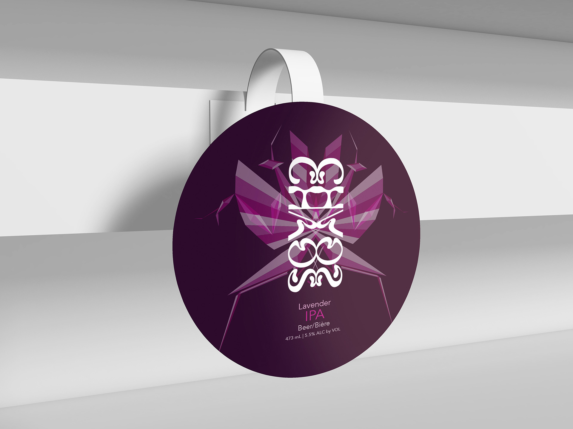
Mockups
