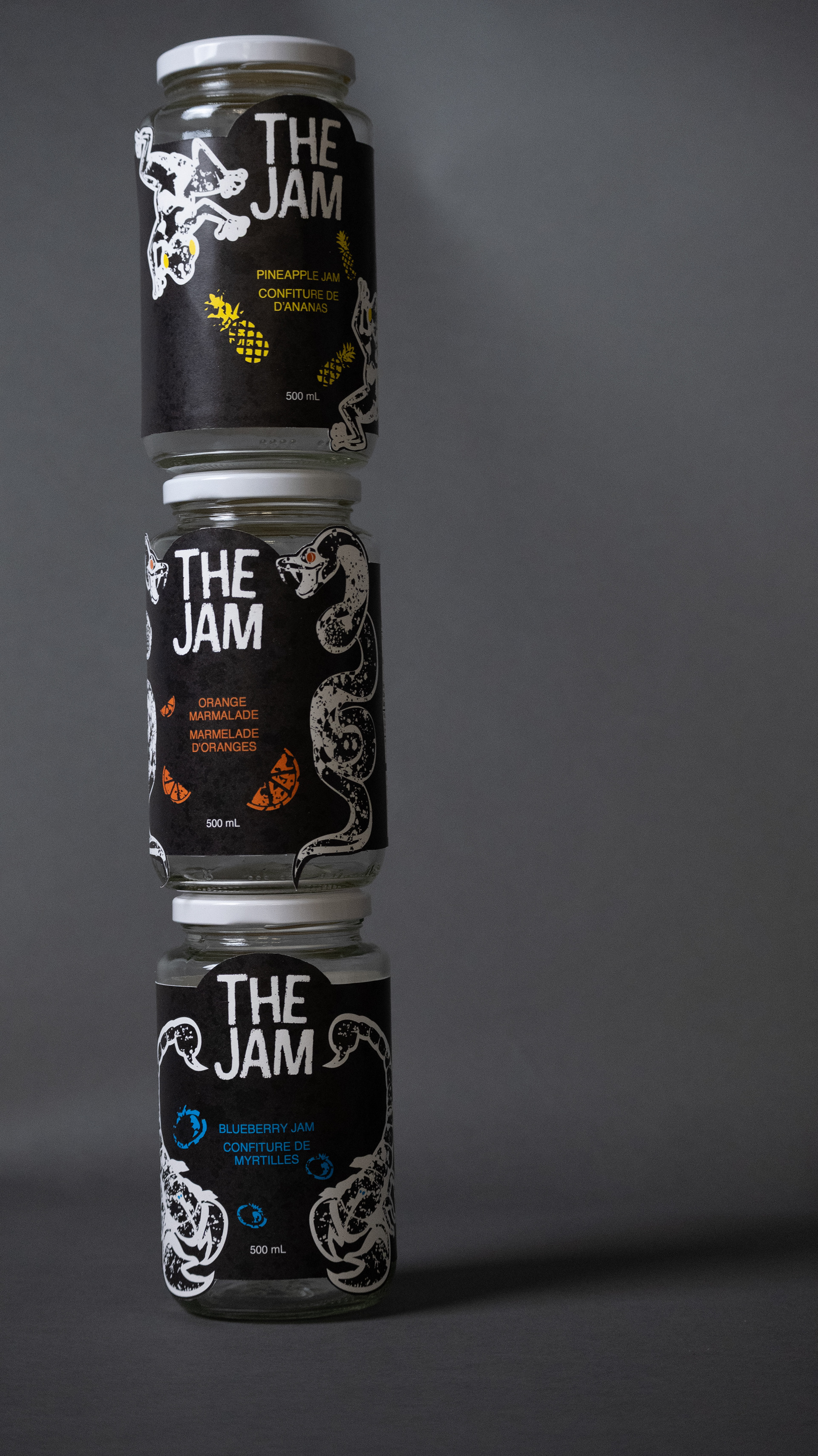
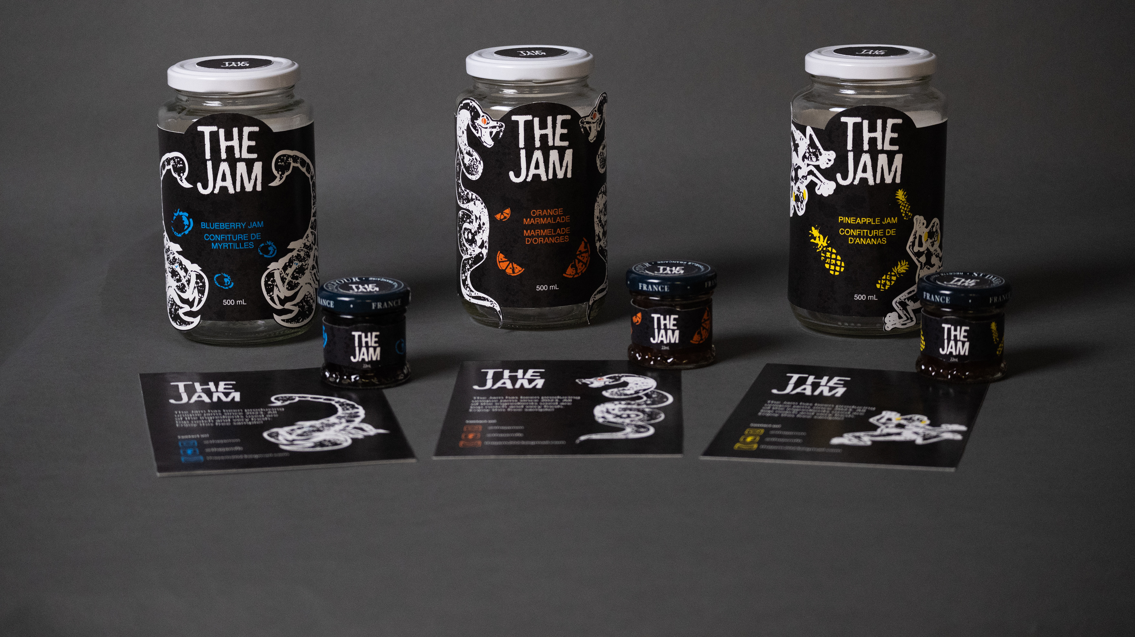
Adulting has been notoriously hard as long as people have been around. There are lots of new challenges to face, both financially and emotionally; it gets quite demanding. In the current state of the economy, many are struggling to afford to feed themselves. Due to this, The Jam has a unique selling proposition: it is affordable and of good quality. To allow both these traits, I imagined there would be an online donation and volunteer option generating money to offset the price, making it an affordable option.
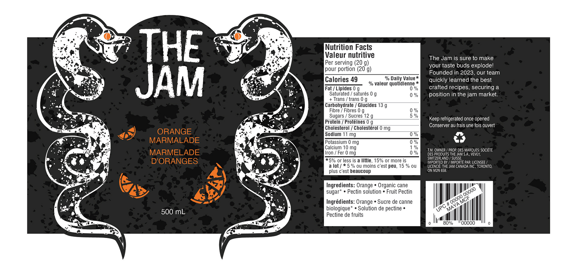
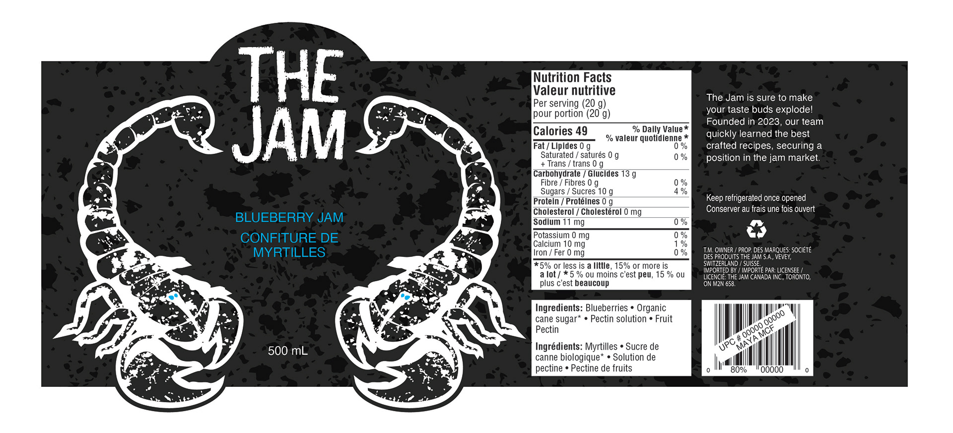
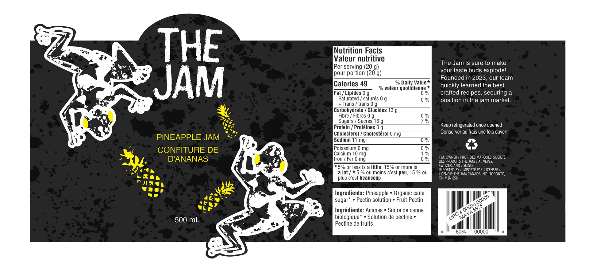
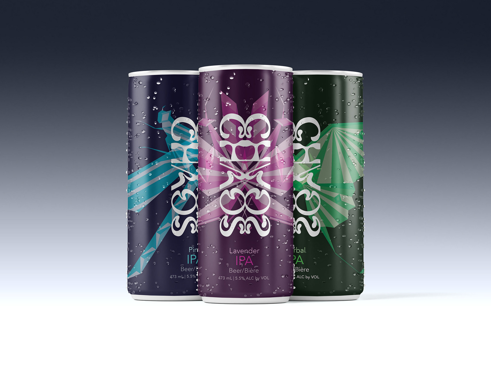
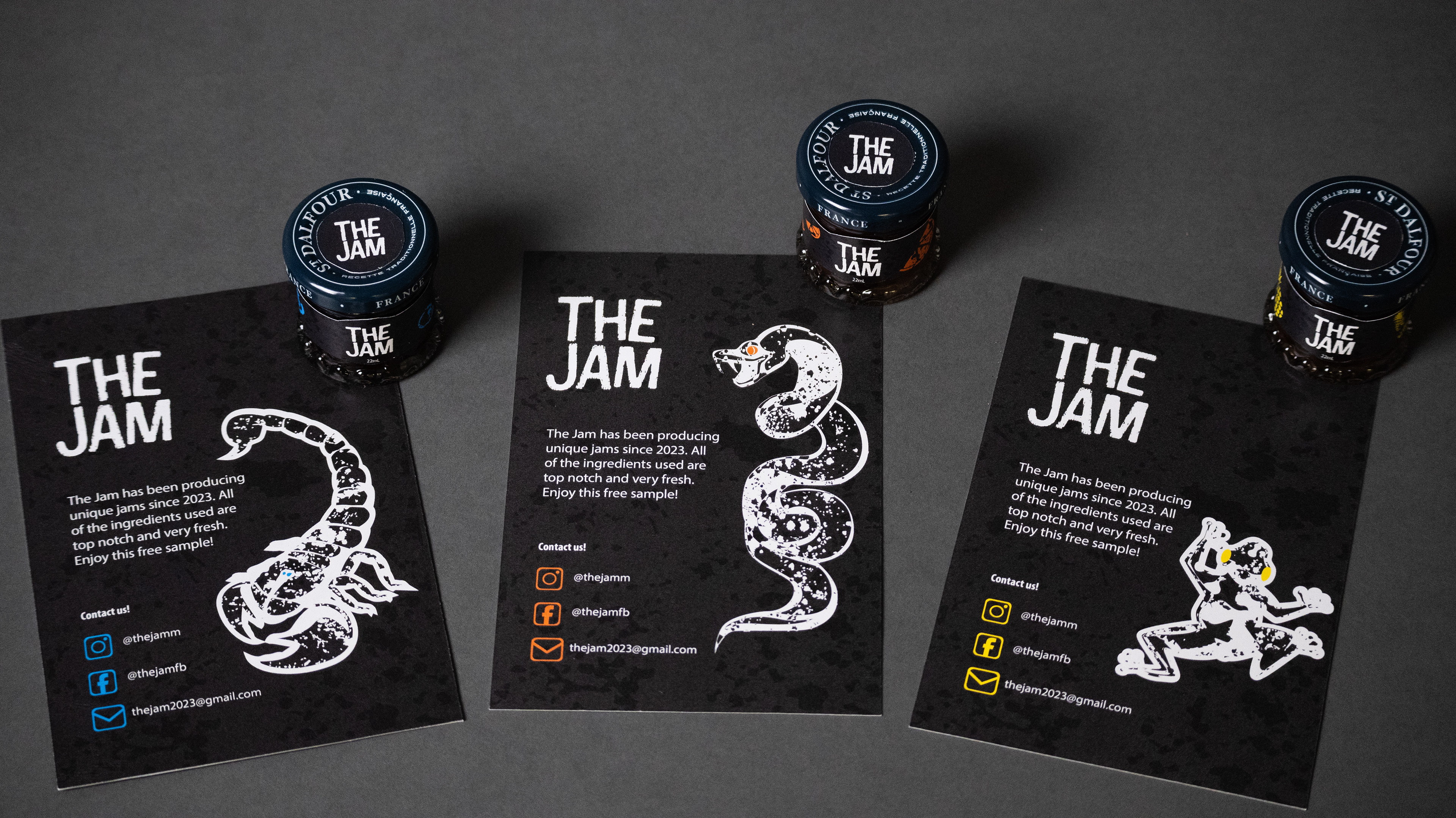
While pushing to aid young adults who are having adulting hardships, it also speaks to the topic visually. There is a rough texture in the background that symbolizes the hardships of adulting, versus the typical brightly coloured jams being targeted toward children. Blue, orange, and yellow are chosen as they pop in contrast to the dark background, and they are also correlated with three animals: a viper, a scorpion, and a poison dart frog. The reason is that these animals are poisonous, foreshadowing young adults' struggles in life.
The result of this design would theoretically be that struggling young adults would be able to enjoy this sweet jam at an affordable price, and the brand would raise awareness of the issues young adults face.
Flat label
